Drag the white line sideways to switch views
⬇️
View Map PDF
Design Process
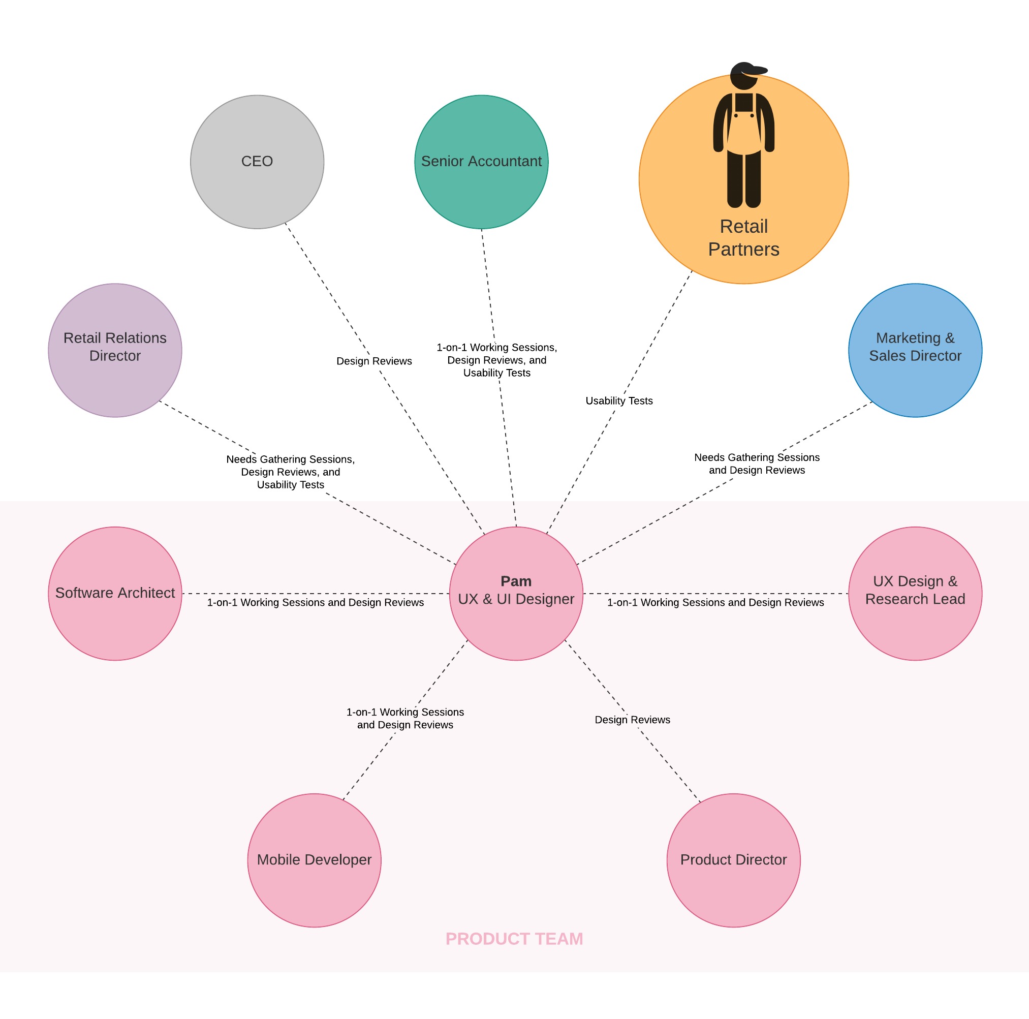
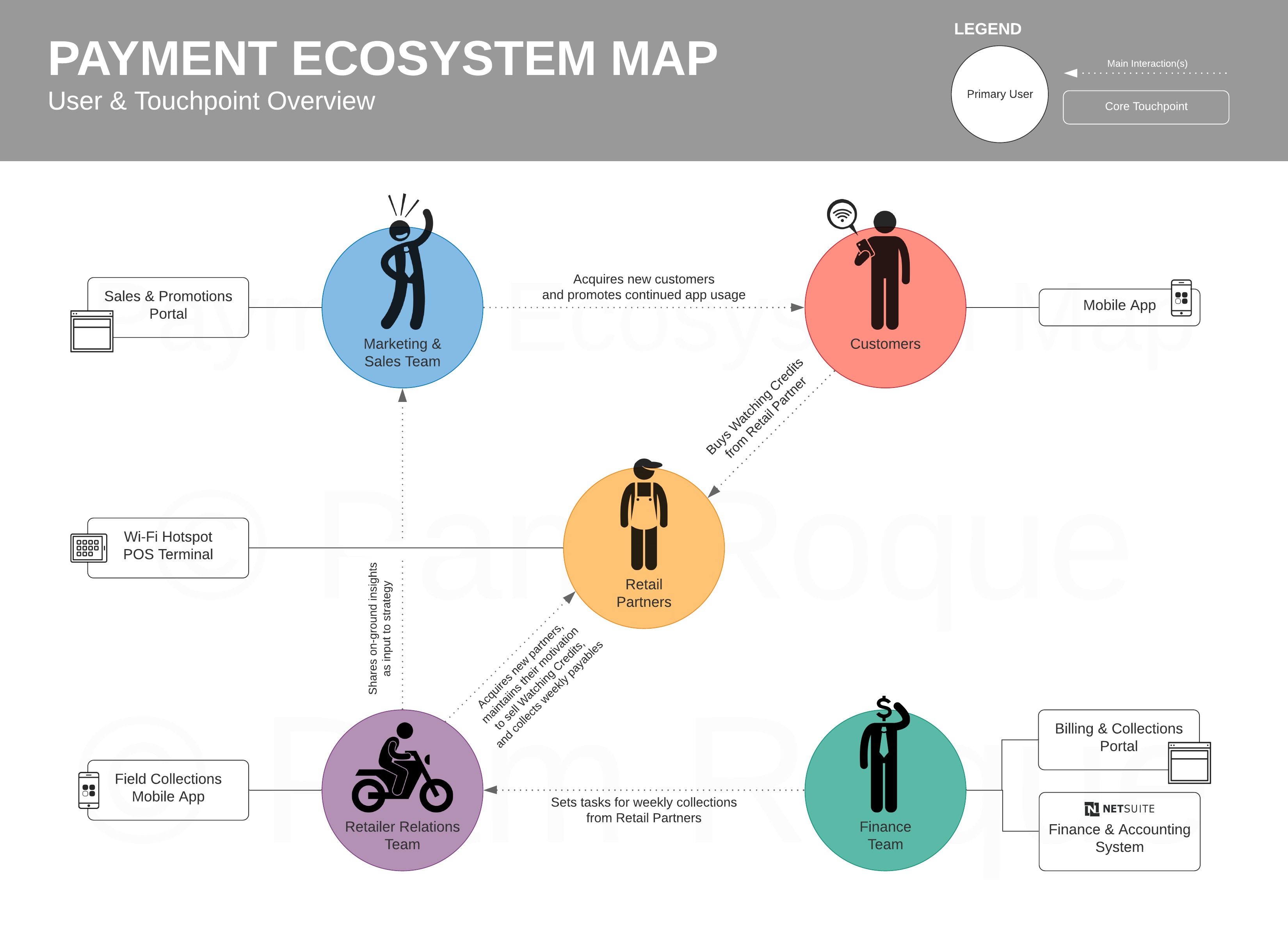
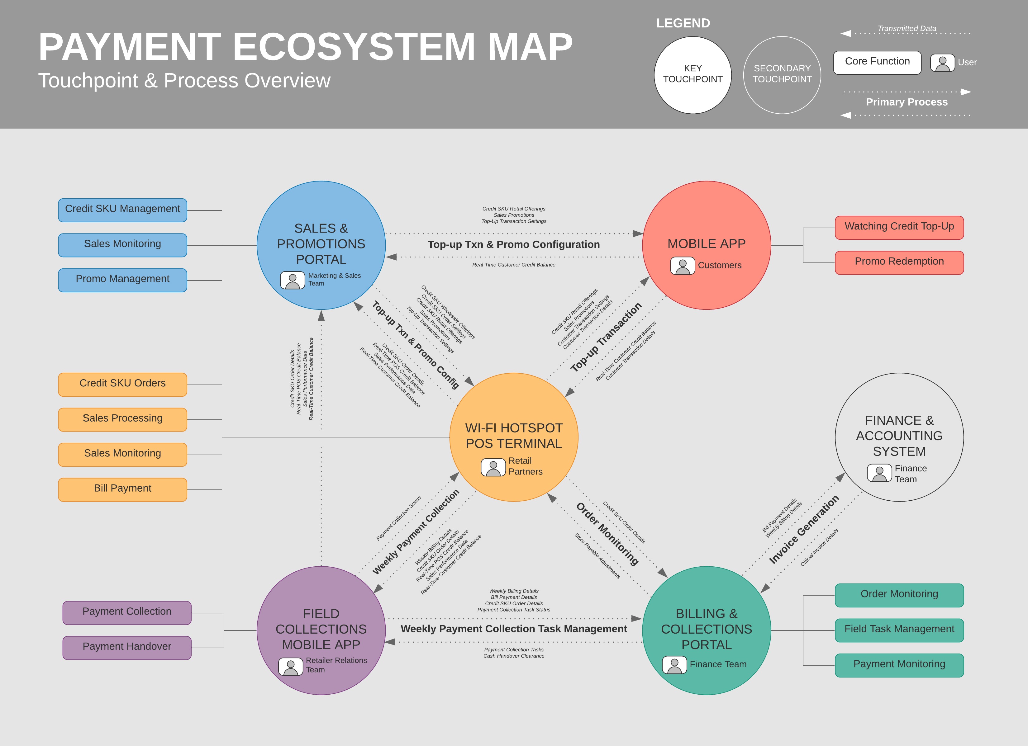
The entire project spanned multiple man-months of work to do, and essentially involved me mapping out the entire ecosystem from scratch and clarifying an inexistent view of the entire process through a traditional design thinking approach involving multiple rounds of discussions with the various stakeholders as part of the Empathize and Define stage.
Challenges
What made this more tedious than usual is that there was another stakeholder involved that couldn’t be in the room—the Philippines’ Bureau of Internal Revenue (BIR)—since this deals with business revenue. More often than not, it had a significant bearing on what information gets displayed when, where, and how.
Thus, in order to be legally compliant while at the same time not sacrificing too much on: 1) implementing the ideal UX; and 2) maintaining creativity and innovation throughout the entire process, close collaboration among the Legal, Finance, Retail Relations, and Product Teams was very essential in order to properly understand each perspective and make the right trade-offs when needed.
The Outcome
Given the scope of the project and the confidential nature of the discussions that happened, I could not discuss every single User Story involved but below is a preview of some of the non-customer-facing touchpoints:
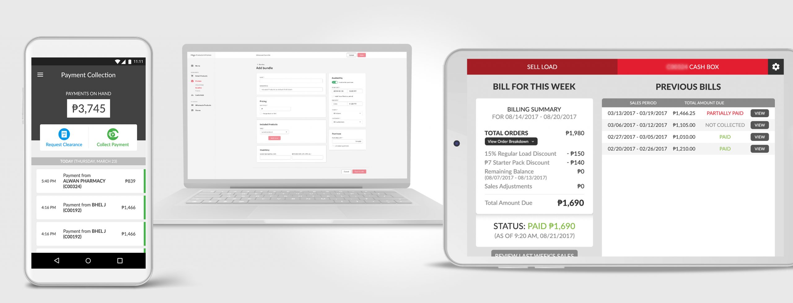
All that said, some UI design decisions to note here are:
- The Wi-Fi Hotspot POS Terminal is predominantly used by senior citizens in their 60s. Thus, it was imperative that the priority here was to ensure that font sizes are big enough here so that this is something they can read properly all throughout.
- Trust between the Retail Partners (users of the tablet POS) and the Retail Relations was incredibly important to build, especially since the company was very new at the time. Hence, the inclusion of the full history of bill payments and clear statuses (Paid, Not Collected, etc.) was very important to highlight.
- The Field Collections Mobile App is primarily going to be used during daytime and under direct daylight since transactions with the Retail Partners are done mostly outdoors. If there’s one thing I’m sure all of us have experienced at one point or another when using phones under direct daylight, it’s that it’s so hard to see the screen so your display needs to be incredibly bright to be able to see things. Knowing this, the intention for choice of the colors there is to make sure there is as much contrast as possible and the UI is bright enough (read: Dark Mode is N/A here!) to be seen properly.
- That said, beyond the app itself, in hindsight I would have also suggested for one of those motorcycle-mounted phone covers as staple equipment for the Retail Relations Team to aid in giving shade to their phones under bright daylight.


